MacroSnaps28 September 2026
No. 79For most of the last century, the main thing deciding your income was which country you were born in. That has gone into reverse.
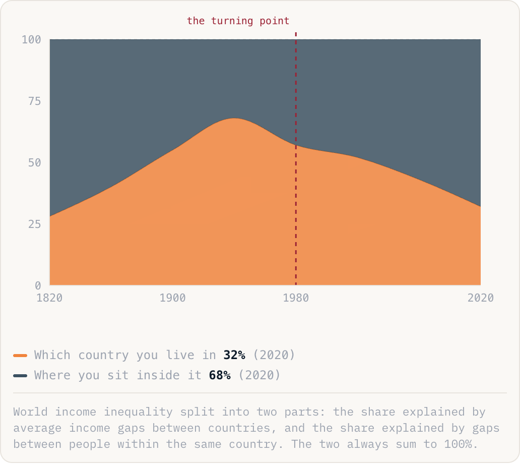
Which country you live in32%(2020)Where you sit inside it68%(2020)
World income inequality split into two parts: the share explained by average income gaps between countries, and the share explained by gaps between people within the same country. The two always sum to 100%.
Why this is happening
- Asia is the whole of the first half. China's income per person went from about 2% of America's to roughly a third, and India, Vietnam, Indonesia and Bangladesh did versions of the same, pulling more than a billion people towards the world average.
- Meanwhile most rich countries got less equal at home. Top incomes ran away from the middle, wages stopped tracking productivity, and asset owners gained far more than wage earners.
- Several big developing countries got less equal too, so both effects push the same way: the world is converging between nations and diverging inside them.
The take
These two facts are usually reported as opposites, one optimistic and one grim, and they are actually the same story seen from different heights. It also has a political consequence: as long as the gap was between countries, it was somebody else's problem. Now it sits inside every electorate, which is why the politics of inequality got so much louder just as the world as a whole became more equal.